- HOME
- Corporate Profile
- Company Data
Company Data
Data
| Name | Japan Airport Terminal Co., Ltd. |
|---|---|
| Date of Establishment | July 20, 1953 |
| Paid-in Capital | 38,126,000,000 yen (As of March 31, 2026) |
| President | Kazuhito Tanaka |
| Address | Terminal 1, 3-3-2 Haneda Airport, Ota-ku, Tokyo 144-0041, Japan Tel: +81-3-5757-8000 |
| Number of Employees | 326 (as of March 31, 2026) |
| Stock Listing | Prime Market, Tokyo Stock Exchange |
| Business Operations | [Operations at Tokyo International Airport (Haneda)]
[Operations at Narita International Airport, Kansai International Airport and Central Japan International Airport]
[Overseas operations]
|
| Major Shareholders |
* As of March 31, 2026 |
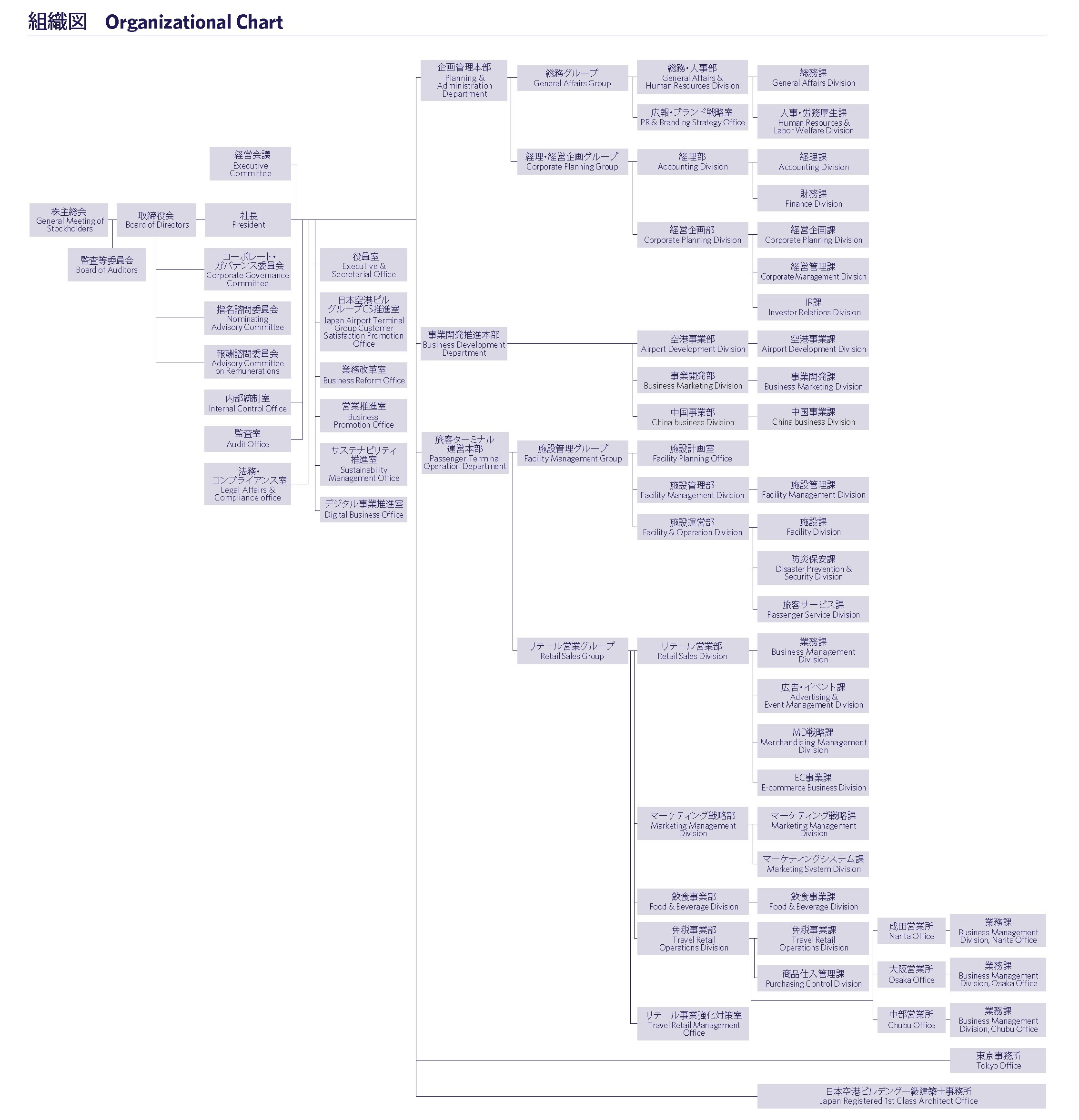
Organization
Feelings Embedded in the New Logo
Concept "HANEDA CROSSING"
Haneda Airport represents a crossroads of possibilities.
By integrating the diverse personalities of group companies and employees, we aim to create a future unique to the Japan Airport Building Group. The new logo, developed from the concept of "HANEDA CROSSING," expresses this sense of unity through the original design of the letter "H."

Symbol Color "HANEDA BLUE"
Indigo has long been familiar to the Japanese people and has been praised as “JAPAN BLUE” around the world. HANEDA BLUE” was developed based on “Tomekon," the darkest of all indigo colors.
The incorporation of antibacterial indigo dye into daily life is considered a manifestation of the Japanese people's sense of cleanliness, making it a color perfectly suited for the world's cleanest Haneda Airport.
The wish to "enrich the world" is expressed by the craftsmen's time-consuming and deep-dyeing the product over and over again, indicating their intention to enrich the world with Haneda Airport as a starting point.
Feelings Encapsulated in the "H" of HANEDA
1 : The straight vertical line represents a runway extending towards a shared future, symbolizing a determined gaze towards people.
2 : The curved horizontal line symbolizes the horizon connecting with the world, signifying a grand gaze towards the Earth and the environment. Inspired by the traditional Japanese calligraphy stroke known as "harai," this design expresses dynamism. By combining these two perspectives, it represents a "leap towards the future."